Redox potential measurement for industry and research
BQC (Bioquochem) is a biotechnology company specializing in the development of tools for measuring redox status, a key parameter in multiple biological and industrial processes. From its laboratories in Asturias, the company designs, manufactures, and markets innovative technological solutions aimed at sectors such as agri-food, biomedical, and cosmetics. With a strong commitment to R&D and knowledge transfer, BQC has positioned itself as a benchmark in the field of redox analysis.
From ingenyus* we have collaborated in the design of communication materials and in enhancing their digital presence. The objective was to create clearer, more attractive, and segmented graphic materials that would help explain the value and applicability of their products across different sectors. Our work therefore included the layout of sector-specific brochures and a basic redesign of the website for their edrop.io platform, with special focus on structure, visual design, and adaptation to multiple languages.
adapted editorial design
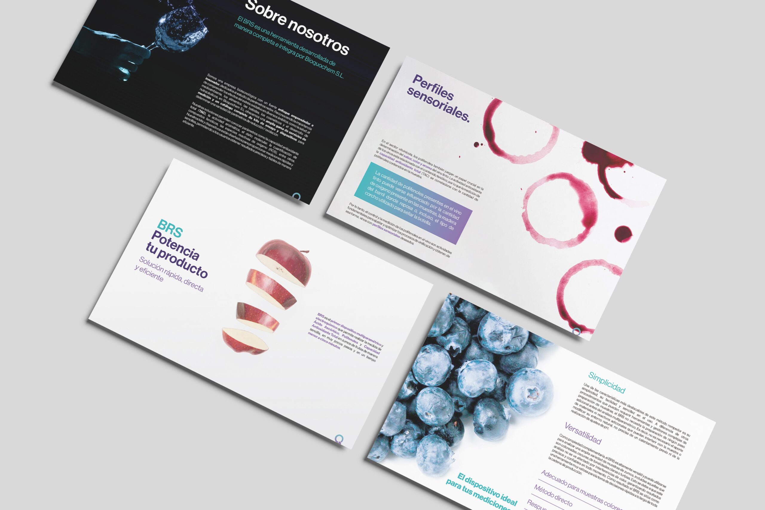
From the outset, we worked to create a collection of brochures that, while sharing a common visual foundation, could be adapted to the different audiences and sectors in which BQC operates. In this regard, we designed and laid out specific materials for applications in wine, juice, biomedical research, cosmetics, and other fields, paying close attention to content hierarchy, color usage, sector-specific iconography, and readability. In this way, each brochure clearly communicates how the product works and the benefits it offers in its specific context of use, reinforcing brand identity and supporting both commercial and outreach efforts.

website redesign
We also undertook the redesign of the edrop website, a platform developed by BQC for monitoring redox status. We proposed a cleaner, more organized, and functional visual structure, aligned with the editorial design defined in the brochures. The redesign included a review of the layout, an update of the graphic styles, and the addition of content in both English and Spanish, ensuring a more accessible and coherent browsing experience. The result was a clearer website, fully aligned with BQC’s visual identity and designed to accurately communicate the advantages of its technology.


