

Take a look around you, in your kitchen, on your computer equipment, or in the shop windows of furniture, decoration, or car dealerships. What colors do you see repeated the most? Which ones do you see the least? I might be wrong, but surely you see a lot of black, gray, and white around you, and yet, very few yellows, reds, or oranges. In the world of brands and products, we have left behind the decades of multicolor; we are moving away from colors and stepping into a monochromatic and desaturated era. Let’s play a game: I will mention a color, and you think of a brand:
Red
Orange
Depending on your age, location, environment, profession, or culture, different brands might have come to your mind, but you probably associate each of these colors with the following brands: Ferrari, Coca-Cola, Santander, Supreme, Metro de Madrid, Vodafone, Butano, Fanta, Orange, Galp, Nickelodeon, Firefox…
Let’s make it more challenging, now only beverage brands:
Green
Blue
Gold
Let’s see if we match: Heineken, Seven Up, Sprite, Starbucks, Carlsberg, Pepsi, Red Bull, Bombay Sapphire, Freixenet. Well, I admit that not many came to mind for gold…
Color is a key aspect for brands to consider because, although it may not seem so relevant, it is. Different colors make your audience identify with your brand and create an unconscious association. So, colors like green and blue are associated with environmental respect.
Brands use colors as a key to convey new values and adapt to changing times. At ingenYus*, we have made various changes throughout our history, but if we’re known for one thing, it’s that we have gradually shifted towards darker colors. Ultimately, our color is black.
This change is not unique to us; it also happens to other brands and products. In fact, it’s a trend that has been evolving slowly for two centuries.

Source: Cath Sleeman, PEC, Nesta, Science Museums Group Collection
As we can see in the graph above, in the year 1800, the range of colors used in products was much broader than what is used today. Not only has it evolved towards a grayscale scale, but the use of blue has expanded while yellows and brown tones have been limited. This could be due to the change in materials used in products, reducing wood and leather and increasing the use of plastics and their derivatives.
Focusing on specific objects, we can see that neutral colors are the most commonly used in clothing, in modern house design, and that a grayscale palette has taken over vehicles.
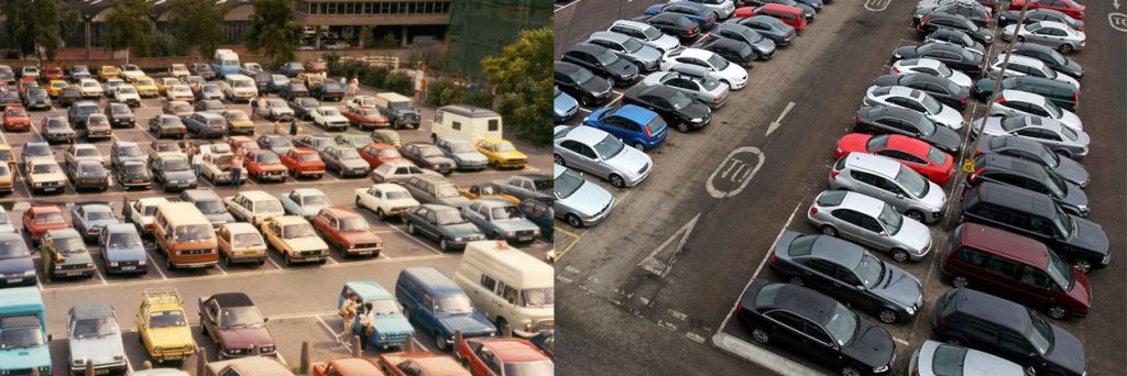
Source: The Cultural Tutor on Twitter
In the image above, we can see a comparison between a parking lot in the 1980s and one today, highlighting the limited variety of colors beyond grayscale.
Before we finish, we should mention Cath Sleeman, a data scientist who has conducted a fantastic study on color and form for the Science Museums Group Collection, and The Cultural Tutor (their Twitter handle) who has a fantastic newsletter called Aeropagus.
Both of them have inspired us to create this entry.
And on a personal level, what do you think about this trend in color use?