Clinical genetic integration
Genomepleio is a software based on connecting clinicians with geneticists in order to expand the diagnosis of genetic pathologies in patients. The application uses the OMIM database of the Johns Hopkins University as an information base to correlate signs and symptoms with diseases and the genes that trigger them. It also serves as a means of communication between clinicians and as a centraliser of information.
Strategy
To fully reflect Genomepleio, we undertook a conceptualisation and research process to create a strong brand identity that reflected the core values. After the completion of the ICG, we carried out the development of a website to showcase the brand with a unified graphic style.
dimension of the project

branding
The development of the corporate image is part of Genomepleio’s main service. The logotype is the main element of the brand, providing a groundbreaking image with personality, with which the brand will be identified at all times.
The use of a typography that combines its vertices and rounded edges creates a “playful” appearance without losing the seriousness and strength of the brand. An authentic inspiration from the “Bauhaus” style, in which geometric shapes and the san-serif style merge to obtain a more attractive result, while at the same time capturing simplicity and ease. Following this artistic trend, klein blue is established as a flat colour, for its application in negative, while white will be applied in its positive versions, thus allowing the use of textures and bright colours as a background.
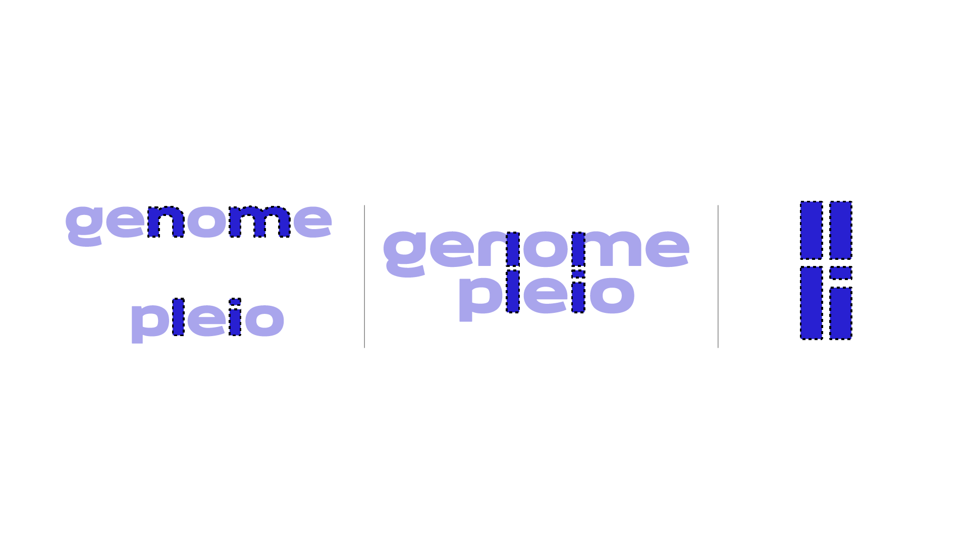
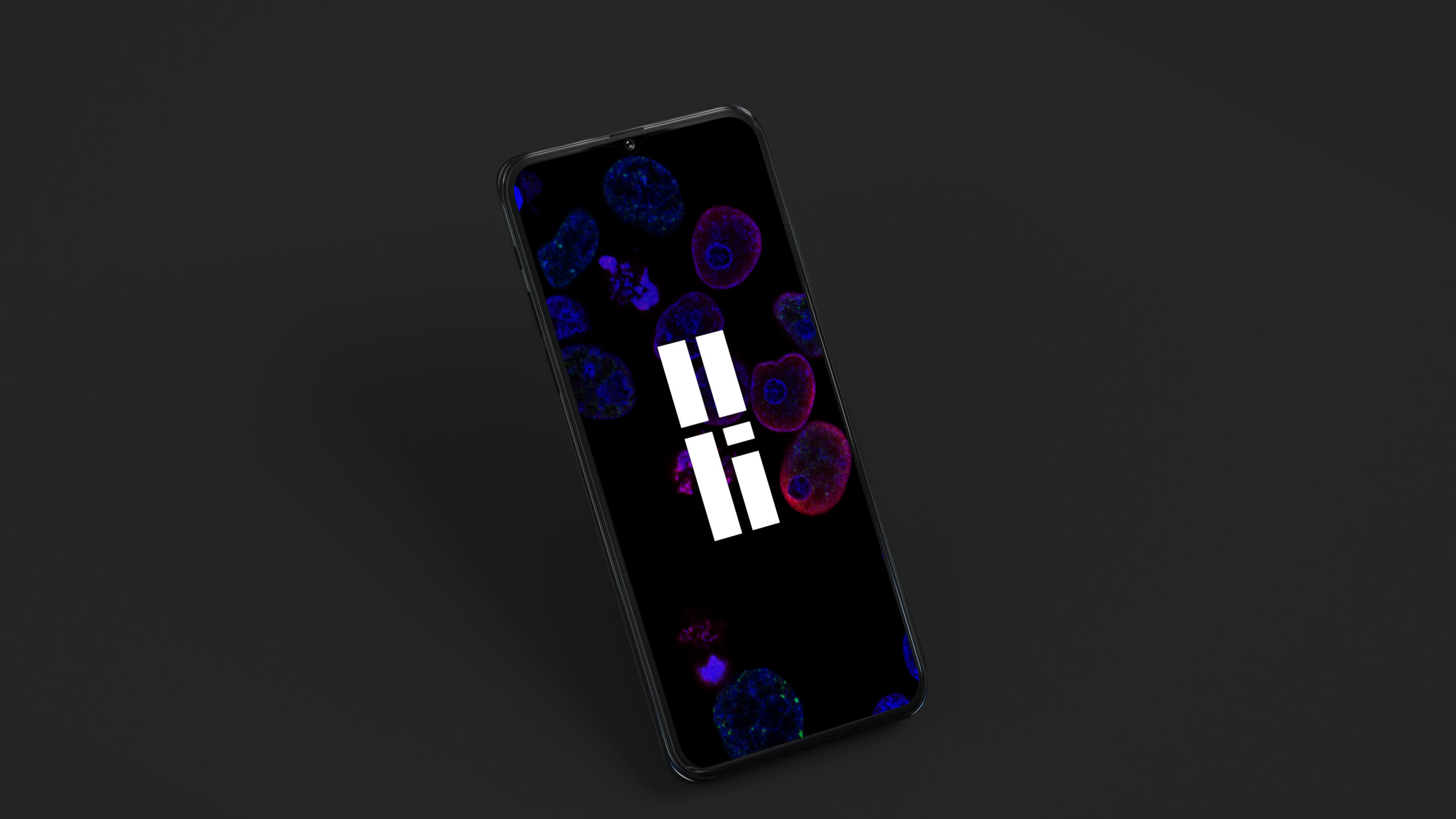
The symbol created for Genomepleio fully characterises the brand and can be used individually as an identifying graphic element. By playing with the geometric shapes of the characters, we generated a symbol. The two parallel stripes represent a genotype, while at the same time we generated a series of “roads” along which the information circulates. In this way, we reflect the connection and union of information, one of the main objectives of the brand.

web design
We developed the website taking into account the previously established corporate brand identity. The result, a website that stands out in its sector thanks to an original and bold design. The inclusion of moving elements and the vibrant blue colour create a visually attractive and different composition.
In addition, we have prioritised the usability and functionality of the page ensuring that any user can navigate without difficulty. We have also carried out SEO optimisation in order to improve the positioning in search engines such as Google.
In short, we have created an intuitive and differential website that also complies meticulously with the standards of responsive design, thus providing an optimal experience from any point of search.


